
How to Write an ATS-Friendly Resume That Still Looks Good
An ATS-friendly resume does not have to be ugly. The best resumes are simple enough for software to read and polished enough for recruiters to take seriously.
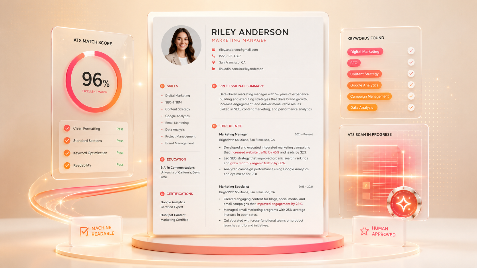
There is a common myth that ATS-friendly resumes have to be plain, boring, and visually lifeless.
That is not true.
An ATS-friendly resume should be clean. It should be structured. It should be easy to parse. But it can still look modern, confident, and professional.
The real problem is not design itself. The problem is design that gets in the way of the content.
If your resume relies on text boxes, graphics, icons, columns, images, or unusual layouts to communicate important information, applicant tracking systems may struggle to read it correctly. Even worse, a recruiter may open the file and see something that looks designed but feels hard to scan.
The goal is not to make a resume for a robot. The goal is to make a resume that works for both screens: software first, human second.
What ATS-friendly really means
ATS stands for applicant tracking system. Companies use these systems to collect, organize, search, and review job applications.
An ATS-friendly resume is one that the system can read cleanly.
That usually means:
Text is selectable.
Sections are clearly labeled.
Job titles, company names, and dates are easy to identify.
Keywords appear in normal context.
Formatting does not scramble the reading order.
Important information is not trapped inside images or graphics.
ATS-friendly does not mean “guaranteed to beat the system.” That phrase is misleading.
Different companies use different systems in different ways.
A better way to think about it is this:
That is worth caring about.
“ATS-friendly does not mean designed for robots. It means clear enough for software and strong enough for humans.”
An ATS-friendly resume reduces the chance that your resume gets misunderstood before a human sees it.
Why design can cause problems
A resume can look impressive visually but still create problems underneath.
Some design elements affect parsing. Tables can make content appear in the wrong order.
Text boxes can be skipped. Icons can confuse section labels. Headers and footers can hide contact information. Skill bars may look nice but communicate very little. Images containing text may not be read at all.
The issue is not that all design is bad. The issue is that resumes are not posters. Design should support the content, not become the content.
For most applicants, the safest design is a clean single-column structure with strong spacing, bold section headings, readable fonts, and subtle visual hierarchy.
That can still look good.
A modern resume does not need complicated graphics. It needs confidence, clarity, and restraint.
The best resume structure
Applicant tracking systems and recruiters both benefit from predictable structure.
Use clear section names:
- Contact Information
- Professional Summary
- Skills
- Work Experience
- Education
- Certifications
- Projects
Avoid clever section headings like “Where I’ve Made an Impact” or “My Career Journey” if they replace standard labels. Those can be charming on a portfolio site, but a resume is not the best place to make the reader decode your structure.
For most professionals, a good order is:
Contact information first. Then a short professional summary. Then skills. Then work experience. Then education and certifications.
For early-career candidates, education may come before experience if it is the strongest qualification.
For career changers, a targeted summary and relevant skills section can help create the bridge before the work history.
The structure should make the argument easy to follow.
Formatting rules that help
Good formatting makes the resume easier to scan.
Use a readable font. Keep font sizes consistent. Use bold for job titles, company names, and section headers. Use bullets instead of dense paragraphs. Keep margins clean. Use consistent date formatting.
Avoid placing critical information only in the header or footer. Some systems may not parse those areas correctly.
Avoid using icons as the only labels for phone, email, location, or LinkedIn. Icons can look nice, but the actual text should be clear.
Avoid putting important resume text inside an image. If the text cannot be selected, it may not be parsed.
A clean resume can still have subtle design details: thin dividers, good spacing, polished typography, and restrained accent color. The difference is that the content remains fully readable as text.
Where keywords belong
Keywords matter, but they should not be dumped into one giant skills block.
The strongest keywords appear naturally in multiple places:
- Summary
- Skills section
- Work experience bullets
- Project descriptions
- Certifications
- Tools section
If a job description mentions “KPI reporting,” and you have done KPI reporting, include it in the summary or a bullet where it belongs.
For example:
Keywords in context
Marketing manager with 6+ years of experience leading B2B campaigns, improving qualified lead generation, and building KPI reporting dashboards for cross-functional teams.
That is better than a random keyword list that says:
Keyword stuffing
KPI, reporting, dashboards, marketing, campaigns, cross-functional, leadership, growth.
Keywords are useful because they help describe real experience. They become a problem when they feel stuffed, disconnected, or dishonest.
Keywords work best when they appear where they naturally belong.
See how your resume scores
Upload your resume and ResumeShine highlights what to fix — keywords, impact, and formatting — in minutes.
File type matters
Always follow the employer’s instructions.
If the application asks for a DOCX file, upload DOCX. If it asks for PDF, upload PDF. If it allows both, either can work if the file is clean and text-based.
A PDF preserves layout and usually looks more polished. Many modern applicant tracking systems can parse text-based PDFs well.
A DOCX file can be safer for older systems or recruiters who want to edit, annotate, or import the document.
Avoid scanned PDFs. Avoid image files. Avoid design exports where the resume text becomes flattened into an image.
A quick test is simple: open your resume and try to select the text. If you cannot highlight and copy the text, that is a problem.
Requested file type wins. If no instruction is given, use a clean text-based PDF or DOCX.
How to test your resume
You can run a simple ATS-readability test without any special software.
Open your resume. Select all the text. Copy it. Paste it into a plain text editor.
Then look at the order.
Does your name appear first? Is your contact information readable? Do section headings appear clearly? Are job titles, company names, and dates in a logical order? Are bullets grouped under the right roles? Did columns get scrambled? Did anything important disappear?
This test is not perfect, but it catches many formatting problems.
You can also read the resume quickly as if you were a recruiter. In ten seconds, can you tell what role the person wants, what they are good at, and why they might fit?
If not, the problem may not be the ATS. It may be clarity.
What still needs to look good
ATS-friendly is only half the job.
Once a recruiter opens your resume, it still needs to feel polished. A resume that is readable but sloppy can hurt you. A resume with inconsistent spacing, crowded bullets, weak hierarchy, or messy alignment can make the candidate look less careful.
A good-looking ATS-friendly resume usually has:
- Clear hierarchy
- Strong section spacing
- Consistent bullet style
- Clean date alignment
- Minimal but intentional accents
- No clutter
- Enough white space
- Strong first page content
Your resume should feel easy to move through. The reader should not have to work hard to find your strongest qualifications.
Create a two-column card:
- Machine-readable
- Text-based
- Structured
- Standard headings
- Clear keywords
- Human-readable
- Polished hierarchy
- Strong bullets
- Clean spacing
- Clear story
Caption:
The best resume works for both.
ATS checklist
ATS checklist
- Before submitting, check:
- Your resume uses standard section headings.
- Your text is selectable.
- Your contact information is not only in a header, footer, or image.
- Your job titles and dates are easy to read.
- Your skills match the role where truthful.
- Your bullets include relevant keywords in context.
- Your formatting does not rely on tables or text boxes.
- Your file type follows instructions.
- Your resume still looks clean when printed or viewed as a PDF.
- You can explain every claim in an interview.
- This checklist is not about gaming the system. It is about reducing friction.
- Create an interactive-looking checklist card with gradient checkmarks and a small status badge:
- ATS preflight: ready to apply
Key takeaways
Remember these
- ATS-friendly means readable, structured, and searchable.
- Beautiful resumes can still be ATS-friendly if the design supports clarity.
- Avoid complex tables, text boxes, images, and formatting tricks.
- Keywords should appear naturally in summary, skills, and experience.
- Recruiters still judge the resume after the system reads it.
Final takeaway
Good resume design is invisible support.
It helps the content get read, understood, and remembered.
Frequently asked questions
No. Plain text is readable, but a resume can be visually polished while still being ATS- friendly. The key is to avoid formatting that hides or scrambles important content.
They can be riskier. Some systems may read columns in the wrong order. If you use two columns, test the resume by copying it into a plain text editor and checking the reading order.
Icons are okay as decoration, but they should not replace text labels. Your email, phone number, location, and links should be written clearly.
Follow the employer’s instructions first. If no preference is given, a clean text-based PDF or DOCX is usually safe.
Companies use ATS tools differently. Some use search and filtering features. Some rely more on human review. A clean resume improves your chances of being read correctly, but it does not guarantee an interview.